the one i chose:
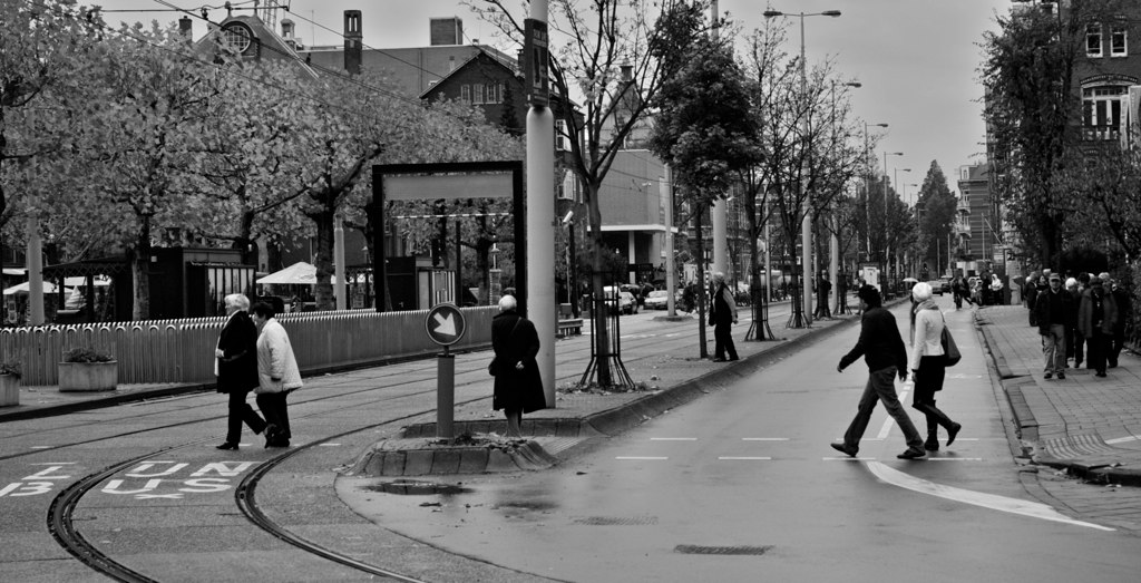
why i don't like this picture: too symmetrical and too busy. maybe if it were just the three people in the foreground, i would've liked it a whole lot more.... just too many people for me.
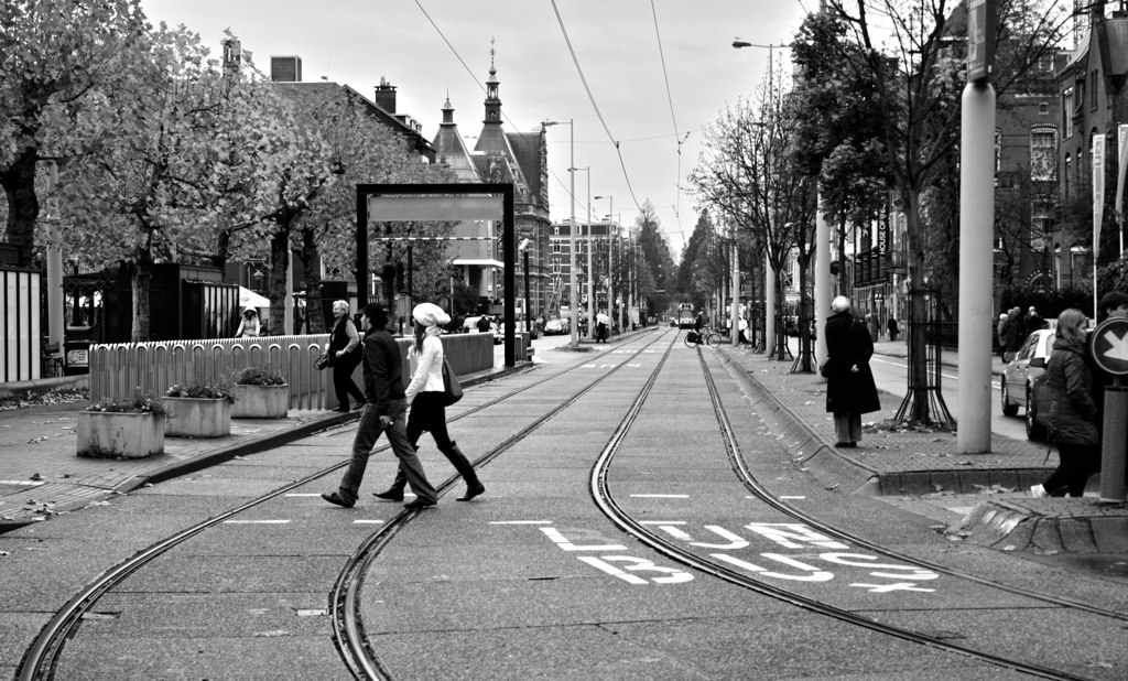
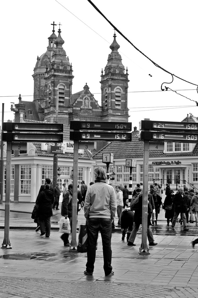
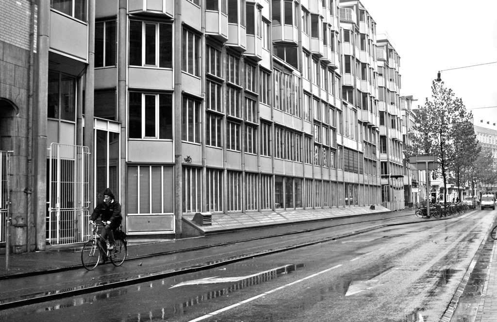
here are a few that i wish i chose:


what do you guys think? did i make the right choice? i guess we'll see when i get my grade... dang it.
6 comments:
blurry, guy mooning, or last one. yum.
although i actually like the first one with the person off on the right.
either way, lovely. amsterdam?
I like the last one a lot! But the one you picked is great too. All the buildings there are so cool!
I've looked at these three times now and I can't decide. Might be the last one is my fave. I can see why you had trouble deciding!
Leslie, be a dear and help an old lady. How do you upload the photos big like that?
Yes, how do you upload photos big like that? And I actually like the one of the guy bumm. Not because of that but because I feel as if I am right there and experiencing the photo as if I am right there, not just an onlooker. Very 'Dorothea Lange'- esque.
if you upload the photos straight from flickr or another online carrier they get that large.
thanks for the feedback for that! thank you!
Thanks! That is useful information.
Maybe Brenda is right about the guy one. It tells more of a story. It's like, Where is he going? wait--Where am *I* going?
Post a Comment